Bridging the Gap Between Design & Code
24 Sep 2018
‘Design & Code’ is a series about design and engineering experiments, processes, and learnings, brought to you by the AirSwap team.
Originally posted in the following publications:
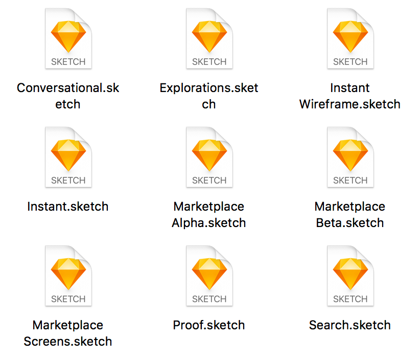
At AirSwap, we have an asynchronous and iterative approach to product development. However, one of the earliest challenges we encountered was maintaining a consistent product identity through iterations of feature work, across multiple product owners. In working on the early versions of the AirSwap Token Trader and AirSwap Widget, we quickly amassed a handful of Sketch files - each file contained a grab bag of symbols and styles that represented the state of our product identity at that point in time. Although this worked in the beginning, our lack of a consolidated source of truth quickly grew into a mess of outdated styles across multiple sources.
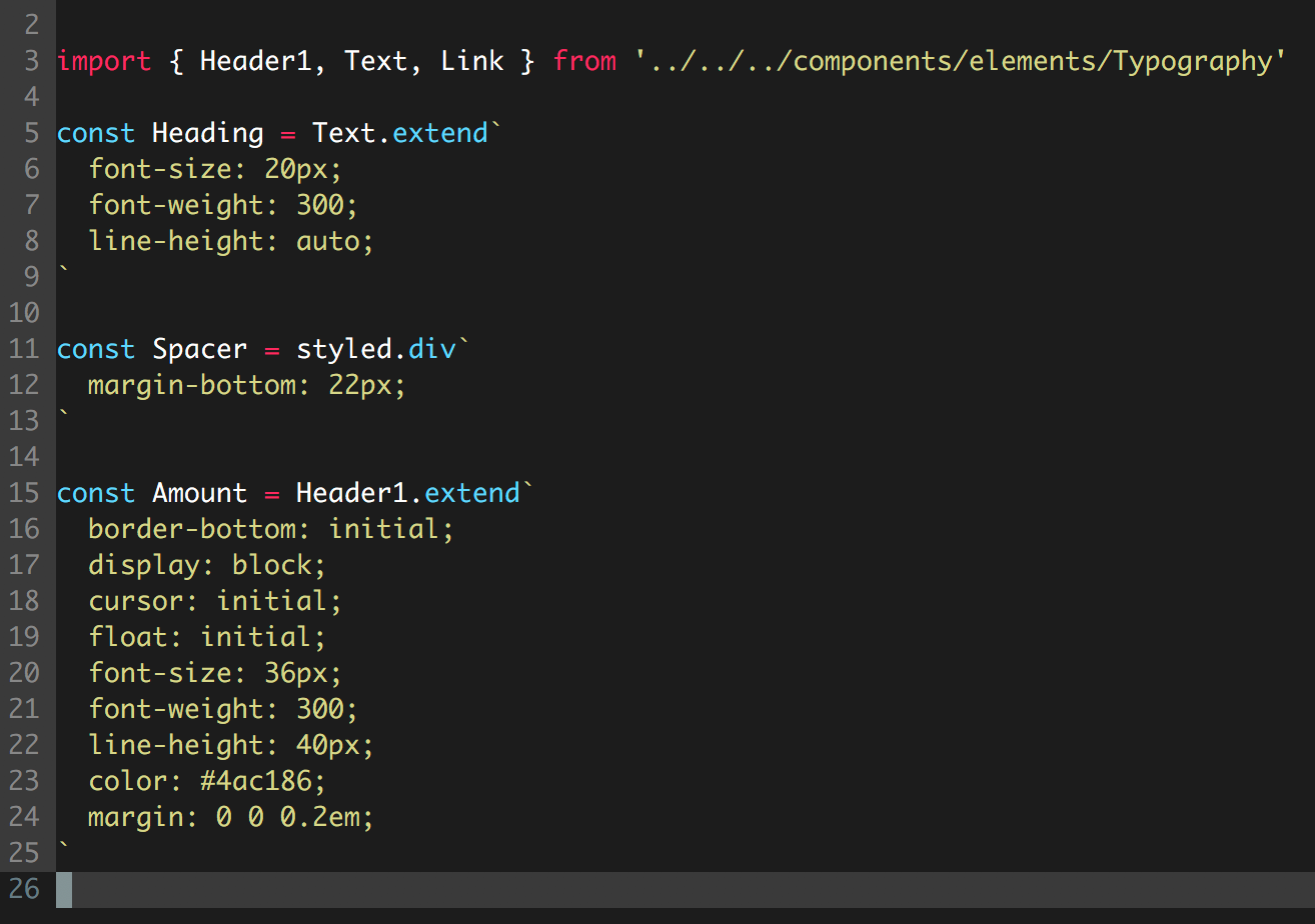
Every frontend experience at AirSwap is written in React. In the beginning, we had a directory of shared components, a preliminary component library if you will, with the proper styles that matched the product identity. However, as we iterated, our product identity changed. Referencing design comps for newer features made it harder to identify whether a particular component already existed or needed to be implemented. We made an early decision to use styled-components, which allowed us to quickly iterate and build features. The ease-of-use that came with styled-components was a huge win, but it also unintentionally allowed us to make some poor decisions in extending styles. Without strict rules on how to create or extend components, our codebase quickly became home to a lot of duplicated code with only minor differences. This not only decreased developer velocity and increased tech debt, but also introduced inconsistency to our product identity.
In our search for a solution to these problems, we’ve recently started experimenting with how to bridge the gap between design and code.
Design Technology
The idea of design technology is nothing new. Tools like Craft and Invision exist to help designers consolidate their styles and bridge that information over to developers. This allows multiple stakeholders to work on different features while maintaining a consolidated set of base components, or a shared component library. However, what we needed was a way to not only maintain parity between designs, but maintain parity between what components constitute a design and what exists in code.
About a year ago, the design technology team at Airbnb released an open source project called react-sketchapp, which enabled React components to render into Sketch. The React community responded favorably, and soon enough, styled components released an extension of their library, styled-components/primitives, with support for multi-target rendering (including rendering to Sketch). These projects became foundational technical solutions to the inconsistency problems we were facing.
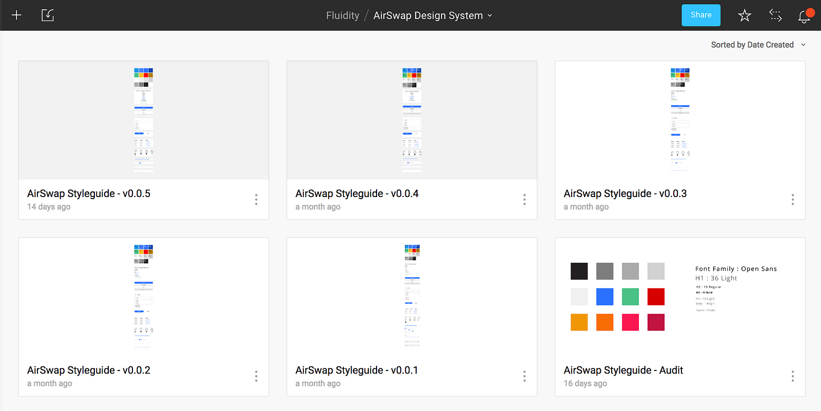
AirSwap Component Library
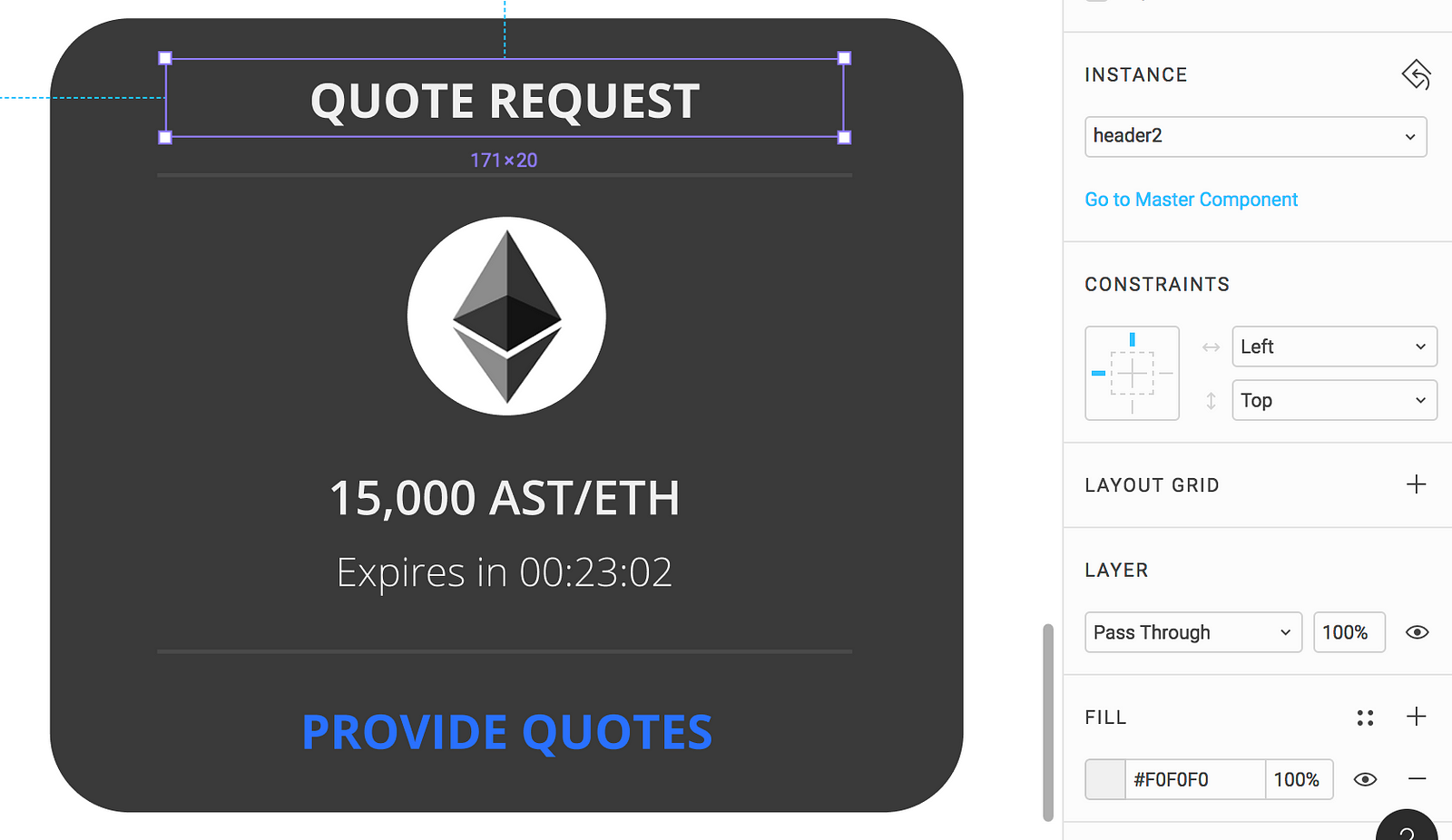
After an exhaustive audit of the AirSwap widget, we identified and recreated in Sketch the set of components that were to be used across all present and future features. We then took the time to recreate this entire component library in React, using styled-components/primitives as our foundation. Our components were rendered as symbols through react-sketchapp, creating a single source of truth for our designs.
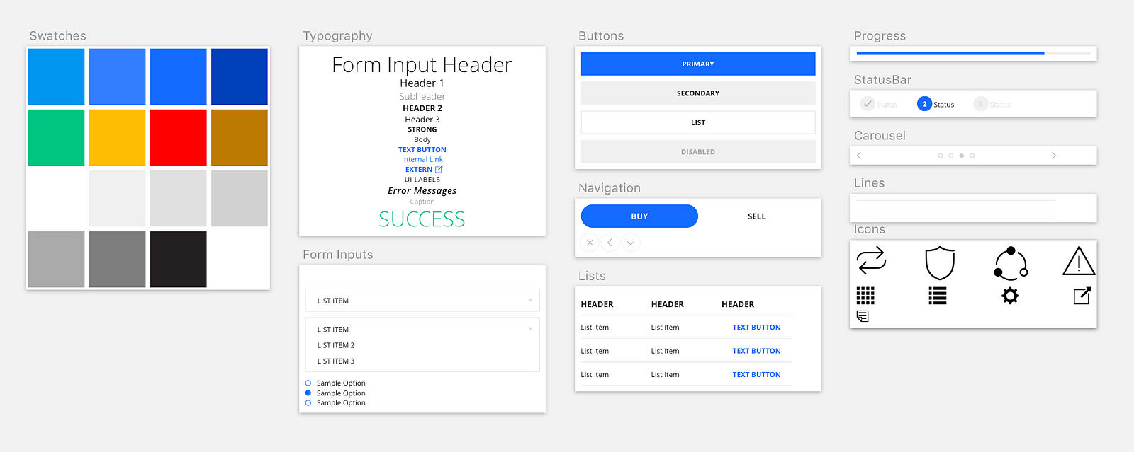
Creating the component library became the basis of our preliminary end-to-end design process at AirSwap. The designs for the components came first, followed by implementation. Because we were using styled-components and react-sketchapp, we could render the implemented code back to Sketch for review. Upon approval, the rendered components would become the new designs, ready for future revision if necessary.
Enter Figma
This cycle eliminates the disparity between code and design. However, we quickly discovered the additional benefits of this solution when we started doing the majority of our design work on Figma. Because our design tools allow us to create Sketch documents from our component library, we upload each new revision to Figma. Comments and requests for changes can be made interactively on the latest revision, which provides specs for the next revision, only to be uploaded when all prior comments are addressed. This is not perfectly seamless (yet), but it creates a UI review process that is informatively similar to GitHub pull requests.
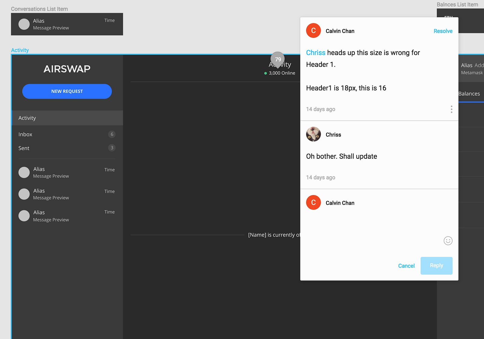
Additionally, using Figma’s shared library features, we can then provide access to these components across all of our design comps. As engineers, we can, in real-time, collaboratively view and edit these comps, which provides clear indication as to which component is being used. This completely eliminates any guessing as to whether or not a component already exists, as the name of the component is displayed on Figma.
What’s Next
Moving forward, we intend to improve and tweak this process to fit more seamlessly into our product development work. There are still several manual and inefficient steps required.
For one, Figma does not currently provide a write-capable API for documents, requiring us to manually upload the generated Sketch files. With proper API support, we can easily integrate this end-to-end process into our continuous integration pipeline. We envision a future where a CI pipeline renders a Sketch file from a tag or branch in a repo (or better yet, render native Figma objects instead of going through Sketch), upload that file to Figma, and link that resulting document to a pull request. Comments from Figma can be cross posted to GitHub, providing seamless communication and feedback between design and code.
Additionally, even though we’ve created the technical foundation for the component library, we have yet to establish practicable rules as to how and when we should extend components and/or create new ones. Which properties of which components can be tweaked on a case-by-case basis, and when do a large number of changes indicate a need to create a new component? We need to identify natural answers to these problems, ideally coming up with automated ways of enforcing those decisions.
With this new component library, we’ve noticed an increase in productivity and efficiency with our design-to-code handoffs. Although far from perfect, the full end-to-end capabilities of this new process has allowed us to increase the velocity at which we iterate on the work, while maintaining a high level of integrity in product identity. The conversation around design and design technology is developing rapidly in many product teams across the world. Design is something we care deeply about at AirSwap, and design technology has become an exciting intersection of product development that we can leverage to help us in shipping awesome products.